


How Typography Impacts Readability in the USA (Design That Gets Read)
We often think of design as pictures, colors, and layout. But for the vast majority of websites, apps, and documents, the primary design element is actually text. In the United States, where digital consumption is among the highest in the world, the way that text is presented—typography—determines whether your message is absorbed or ignored.
Typography is the vehicle for your content. If the vehicle is broken, the passenger (your message) never reaches its destination. Bad typography creates friction. It forces the reader to work harder to decipher words, leading to fatigue, frustration, and eventually, abandonment. Good typography, on the other hand, is invisible. It allows the reader to focus entirely on the ideas being communicated without even noticing the mechanics of reading.
In a market as competitive as the USA, where attention is a scarce currency, you cannot afford to overlook the mechanics of text. This guide explores the critical relationship between typography and readability, offering actionable insights to ensure your content is not just seen, but truly read.
What Is Typography and Readability?
Before diving into complex design theory, we need to establish the ground rules. While often used interchangeably, typography, readability, and legibility are distinct concepts that work together to create a successful user experience.
Typography meaning in design
Typography is the art and technique of arranging type to make written language legible, readable, and appealing when displayed. It involves selecting typefaces, point sizes, line lengths, line-spacing (leading), and letter-spacing (tracking), and adjusting the space between pairs of letters (kerning). It is more than just picking a pretty font; it is functional engineering for the eyes.
Readability vs legibility explained
There is a nuanced difference between these two terms:
- Legibility refers to how well you can distinguish one character from another. It’s a function of the typeface design (e.g., is the ‘b’ distinct from the ‘h’?).
- Readability refers to how easy it is to read words, sentences, and blocks of text. It is a function of how the type is arranged (size, spacing, color).
You can have a legible font (like Arial) but make it unreadable by setting it in neon yellow on a white background with tight spacing.
Why typography matters for digital content
In the US digital landscape, content is abundant. If your typography meaning in design isn’t clear, users won’t struggle through your content; they will simply leave. Typography sets the rhythm of reading. It guides the eye, establishes hierarchy, and signals importance. It is the first impression your brand makes before a user reads a single word.
Why Typography Matters for USA Audiences
The American audience has specific consumption habits that designers must cater to. The “always-on” culture of the US means users are constantly bombarded with information, leading to specific behavioral patterns.
Short attention spans and screen reading habits
Studies suggest that the average human attention span has decreased significantly in the digital age. American users typically scan content rather than reading word-for-word. They look for anchors—headings, bold text, bullet points—to get the gist of the information. If the typography readability in the USA context doesn’t support scanning (e.g., walls of text with no hierarchy), engagement plummets.
Accessibility and inclusive design needs
In the USA, digital accessibility is not just a moral imperative; it’s a legal consideration under the ADA (Americans with Disabilities Act). Typography plays a massive role here. Millions of Americans live with visual impairments or cognitive differences like dyslexia. Proper typography user experience ensures that your content is democratized and accessible to everyone, regardless of their ability.
Typography’s impact on trust and credibility
We judge books by their covers and websites by their fonts. Research has shown that users judge the credibility of a website in milliseconds. A site using Comic Sans for a financial report will be instinctively distrusted. Professional, clean, and balanced readable typography signals competence and authority.
Font Choice and Its Effect on Readability
The most fundamental decision in typography is selecting the typeface itself. This choice sets the mood and determines the baseline legibility of your project.
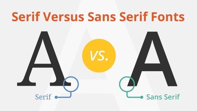
Serif vs sans-serif fonts
The debate between serif (fonts with small feet at the ends of strokes, like Times New Roman) and sans-serif (fonts without feet, like Arial) is ongoing.
- Serif: Traditionally used in print (books, newspapers) because the serifs help guide the eye along the line. They project authority and tradition.
- Sans-serif: Generally considered the best fonts for readability on screens, especially at lower resolutions, because their clean lines remain clear even when pixelated. They project modernity and simplicity.
In the USA, sans-serif fonts dominate the web, but high-quality screens have made serifs viable for digital reading again.
Display fonts vs body text fonts
Display fonts are designed for headlines. They are often bold, eccentric, or decorative. Body text fonts are the workhorses designed for long passages of reading. A common mistake is using a display font for body text, which creates visual chaos.
When decorative fonts reduce readability
Script fonts, grunge fonts, or highly stylized typefaces have their place in logos or short artistic headers. However, using them for more than a few words destroys readability. If the user has to pause to figure out what a letter is, you have broken the flow.
Font Size and Line Length Best Practices
Once the font is chosen, how you size and stretch it on the page is the next hurdle.
Optimal font sizes for web and mobile
Gone are the days of 12px text. The modern web standard for body text is generally 16px to 18px. This accommodates the varying distances at which people view screens. For mobile devices, font size readability is critical; text that is too small forces users to “pinch and zoom,” which is a significant friction point.
Ideal line length for easy reading
Line length (the measure) is the number of characters in a single line of text.
- Too long: The eye has trouble tracking back to the start of the next line (often seen on full-width desktop sites).
- Too short: The eye moves back and forth too often, breaking the rhythm.
- The Sweet Spot: For optimal line length typography, aim for 45 to 75 characters per line (including spaces).
Avoiding eye strain on screens
Proper sizing and line length reduce cognitive load. When the mechanics are right, the physical act of reading requires less energy, allowing the brain to focus on comprehension rather than visual processing.
Line Spacing, Letter Spacing, and White Space
The space between the ink is just as important as the ink itself. This “micro-typography” is often what separates amateur design from professional polish.
Line height and paragraph spacing
Line height (leading) is the vertical space between lines of text. If lines are too close, they look cramped and intimidating (the “wall of text” effect). If they are too far apart, the lines feel disconnected. A general rule of thumb for line spacing readability is to set line height at 1.5 times the font size (e.g., 16px font with 24px line height).
Letter spacing (tracking) basics
Tracking is the overall spacing between a group of letters. Dense blocks of text can benefit from a tiny increase in tracking to let the text breathe. Conversely, headlines in all-caps often need increased tracking to avoid looking aggressive or cluttered.
Importance of white space
White space typography is not “empty” space; it is active design. It gives the eyes a place to rest. Generous margins and padding around text blocks focus attention and make the content feel more upscale and easier to digest.
Color Contrast and Background Choices
You cannot read what you cannot see. Contrast is the core of visibility.
Text contrast accessibility standards
The Web Content Accessibility Guidelines (WCAG) set specific ratios for text contrast readability. Normal text requires a contrast ratio of at least 4.5:1 against the background. Large text needs 3:1. Falling below these standards makes your content invisible to users with low vision or those viewing screens in bright sunlight.
Light vs dark backgrounds
- Positive Text (Dark on Light): The standard for long-form reading. It mimics ink on paper and is generally best for readability in well-lit environments.
- Negative Text (Light on Dark): Popular in “Dark Mode.” It reduces eye strain in low-light environments but can cause “halation” (fuzziness) for astigmatic users if the text is too bright.
Avoiding low-contrast design mistakes
A common trend in modern design is using light gray text on a white background for a “minimalist” look. This is a usability nightmare. Always prioritize clear, high-contrast combinations. Typography accessibility in the USA is not optional; it is essential for reaching the widest audience.
Typography and Mobile Readability
With over half of web traffic in the USA coming from mobile devices, mobile-first typography is mandatory.
Responsive typography
Text cannot be static. Responsive typography scales fluidly based on the device’s viewport. A headline that looks powerful on a desktop monitor might break into six lines on a smartphone, pushing the actual content below the fold.
Touch-friendly text sizing
On mobile, typography often doubles as a user interface (UI) element. Links and buttons are text-based. Mobile typography readability requires that these elements are large enough to be tapped with a thumb without accidentally hitting neighboring links.
Reading behavior on small screens
Mobile users are even more likely to scan than desktop users. Short paragraphs, ample subheadings, and larger text sizes help maintain engagement on small, vertical screens.
Typography in UX and Content Engagement
User Experience (UX) is the sum of all interactions a user has with a product. Typography is the interface for information.
Scannability and hierarchy
Visual hierarchy tells the user what is important. By manipulating size, weight (boldness), and color, you create a map for the reader. The eye should naturally flow from the H1 to the H2, down to the body text. Typography UX design relies on this hierarchy to guide the user through the narrative.
Headings, subheadings, and emphasis
Headings are signposts. They allow users to skip sections they don’t need and find the answers they want. Bold text adds emphasis but should be used sparingly—if everything is bold, nothing is.
How typography affects bounce rate
Bounce rate is the percentage of visitors who leave after viewing only one page. Poor readable content layout is a primary driver of high bounce rates. If a user lands on a page and sees a dense, unformatted block of small text, they will “bounce” to a competitor who presents the information more clearly.
Common Typography Mistakes That Hurt Readability
Even experienced designers can fall into traps that compromise the user experience.
Too many fonts on one page
Using five different fonts creates a disjointed, amateurish look. Stick to two (maybe three) typefaces maximum: one for headings, one for body text.
Poor spacing and alignment
Inconsistent spacing between paragraphs or centering long blocks of text makes reading difficult. Left-aligned text (ragged right) is the standard for Western languages because the consistent starting point helps the eye track.
Ignoring accessibility guidelines
Treating accessibility as an afterthought leads to typography mistakes that exclude millions of users. Neglecting alt text, using poor contrast, or blocking users from resizing text are major errors.
Best Typography Practices for Better Readability
To ensure your content resonates with a US audience, adhere to these fundamental principles.
Consistent font systems
Establish a style guide. define your H1, H2, H3, and body styles and stick to them across every page of your site. Consistency builds familiarity and trust.
Testing typography with real users
Don’t design in a vacuum. Test your typography best practices in the USA with actual users. Watch them read. Do they squint? Do they lose their place? Do they miss the call to action?
Balancing style and function
Typography is a balance of art and utility. You want your site to have personality, but never at the expense of clarity. The goal is to improve text readability first, and add stylistic flair second.
Frequently Asked Questions (FAQ)
What font is easiest to read on screens?
Generally, sans-serif fonts like Arial, Verdana, Roboto, and Open Sans are considered the easiest to read on screens due to their simple geometric shapes. However, modern serif fonts like Georgia and Merriweather are also designed specifically for screen readability.
Does typography affect SEO and engagement?
Yes. While Google bots don’t “see” aesthetics, they measure engagement signals. Good typography increases time on page and lowers bounce rates, which are positive signals for SEO. Furthermore, using proper heading tags (H1, H2) helps search engines understand your content structure.
How many fonts should a website use?
The recommended limit is two or three. A common pairing is one font for headers (to grab attention) and a different, highly legible font for body text. Using more than three slows down website load times and creates visual clutter.
Is dark mode better for readability?
It depends on the environment. Dark mode (light text on dark background) is better for low-light conditions and can reduce battery consumption on OLED screens. Light mode is generally better for readability in bright environments. Offering users a choice is the best approach.
How does typography affect accessibility?
Typography is central to accessibility. It involves using high-contrast colors, allowing text resizing without breaking the layout, using screen-reader-friendly fonts, and ensuring a logical hierarchy so assistive technology can navigate the content.
Final Thoughts on Typography and Readability
Typography is the voice of your text. In the USA, where the digital marketplace is crowded and loud, a clear voice is your strongest asset. Design choices shape how content is consumed, interpreted, and acted upon.
By prioritizing readability—through smart font choices, appropriate sizing, generous spacing, and high contrast—you respect your user’s time and attention. In return, they are more likely to trust your brand, engage with your message, and convert on your goals. Good typography is invisible but powerful; it ensures that nothing stands between your audience and your ideas.