


Trends have a way of crashing onto the scene and receding just as quickly. We’ve seen the rise and fall of skeuomorphism, the brief explosion of “millennial pink,” and the cyclical return of brutalism. Yet, amidst the churning waters of aesthetic preferences, one philosophy stands firm like a lighthouse: minimalism. It is not merely a visual choice; it is a response to the overwhelming complexity of modern life.
When you walk into a beautifully curated Apple store or navigate a clean, intuitive mobile app, you are experiencing the power of reduction. The absence of clutter creates a sense of calm and focus that is increasingly rare. For businesses, designers, and homeowners across the country, the question isn’t whether to adopt this style, but how to leverage it effectively.
Understanding the staying power of this movement requires looking beyond the surface level of white space and simple typography. It connects deeply with psychology, sustainability, and functionality. This article explores the enduring legacy of simplicity and why, decade after decade, Americans continue to embrace the maxim that “less is more.”
What Is Minimalist Design?
At its core, minimalism is about identifying the essential and eliminating the rest. It is the intentional promotion of the things we value most and the removal of anything that distracts from them. In the context of minimalist design USA trends, this philosophy manifests as clean lines, neutral color palettes, and a strict adherence to functionality.
However, minimalism is often misunderstood as simply “making things simple” or “using less color.” While those are often byproducts, the true goal is clarity. It differs significantly from “flat design,” which is strictly a two-dimensional user interface style, and “modern design,” which refers to a specific mid-century architectural era. Minimalism is adaptable; it can be warm, cold, digital, or physical.
The core principles include:
- Function over decoration: Every element must serve a purpose. If it doesn’t help the user or the inhabitant, it is removed.
- Visual hierarchy: Using space and scale to tell the eye where to look first.
- Truth to materials: In physical products and architecture, materials are used honestly—wood looks like wood, and concrete looks like concrete, without hiding their natural textures.
Why Minimalist Design Remains Popular
In a culture that often celebrates excess, it seems counterintuitive that restraint would be the dominant aesthetic. Yet, the reason why minimalist design remains popular USA is directly linked to the amount of information we consume daily.
The average American is exposed to thousands of advertisements and data points every single day. This creates a state of constant cognitive load. Our brains are working overtime to filter out noise. Minimalism acts as a visual break. When a design is uncluttered, the brain doesn’t have to work as hard to interpret it. This ease of processing creates a subconscious feeling of relief and satisfaction.
Visual clarity equates to mental clarity. Whether it is a website that directs you exactly where you need to go or a living room that isn’t overrun with knick-knacks, minimalist environments allow for better focus. This psychological benefit is the primary driver of its longevity. It’s not just about looking good; it’s about feeling good.
Minimalism in Digital Design & UX
Nowhere is the impact of minimalism more measurable than in the digital world. The shift toward minimalist UX design USA has been driven by the need for speed and usability across multiple devices.
When a website is stripped of heavy graphics, excessive animations, and cluttered sidebars, it loads faster. In an economy where a one-second delay in page load time can result in a 7% reduction in conversions, minimalism is a smart business strategy. Faster performance improves search engine rankings and keeps users engaged.
Furthermore, minimalist UX improves navigation. By removing the “fluff,” designers can guide users toward specific actions—like signing up for a newsletter or making a purchase—without distraction. It also plays a massive role in accessibility. High contrast, clear typography, and logical spacing make digital products more usable for people with visual impairments or cognitive disabilities.
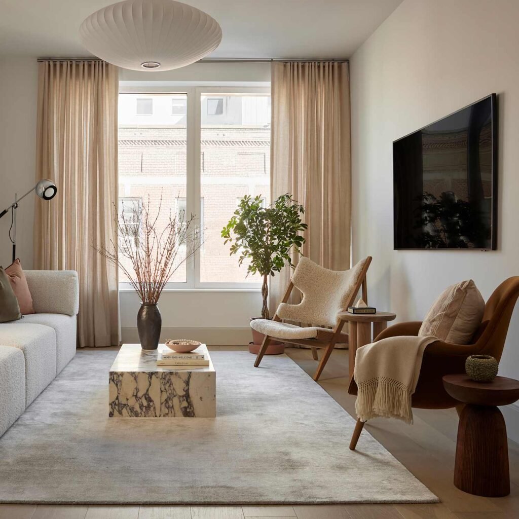
Minimalist Design in Interiors & Architecture
The housing market has shifted significantly over the last two decades. As urban living becomes denser and the cost of square footage rises, Americans are often living in smaller spaces. Minimalist interior design USA has become the practical solution to this reality.
In a small apartment or a compact home, clutter is the enemy. Minimalist interiors utilize open floor plans and smart storage to make small areas feel expansive. By using a neutral palette and allowing natural light to become a primary design element, architects can blur the lines between indoors and outdoors, making rooms feel airier.
However, American minimalism has evolved. It is no longer the sterile, hospital-like aesthetic of the early 2000s. Today, it incorporates “warm minimalism,” which uses natural textures like wool, linen, and unpolished wood to create spaces that are clean but inviting. It answers the homeowner’s need for a sanctuary—a place to decompress from the chaotic world outside.
Sustainability & Minimalist Design
A growing awareness of climate change and environmental impact has fueled the rise of sustainable minimalist design. The two concepts are natural partners. Minimalism encourages a “buy less, buy better” mentality that directly opposes the culture of disposability.
In product design and fashion, this means creating durable items with timeless silhouettes that won’t look outdated in six months. It challenges the planned obsolescence that has plagued American manufacturing for decades. Consumers are increasingly asking for products that last, and minimalist design signals durability.
By focusing on essentialism, manufacturers can use fewer materials and generate less waste during production. For the conscious consumer, a minimalist aesthetic is often a visual shorthand for ethical consumption. It suggests that the brand cares about resources and longevity rather than chasing fleeting fads.
Branding & Marketing Benefits of Minimalism
Think of the most recognizable logos in America: Nike’s swoosh, Apple’s apple, McDonald’s arches. They are deceptively simple. Minimalist branding USA has proven to be the most effective way to build brand recognition in a crowded marketplace.
Complex logos and busy packaging often fail to scale. A detailed illustration might look great on a billboard, but it turns into a smudge when shrunk down to the size of an app icon on a smartwatch. Minimalist branding is scalable. It looks as good on a business card as it does on the side of a building.
Moreover, minimalist marketing conveys confidence. A brand that fills every inch of space with copy and claims often feels desperate, as if it’s trying too hard to convince you. A brand that uses whitespace and concise messaging feels authoritative and trustworthy. It respects the customer’s intelligence and time.
Minimalism vs Bold & Maximalist Trends
Of course, the design world is not a monolith. There is a constant push and pull between minimalist vs maximalist design. Maximalism—characterized by bold patterns, saturated colors, and an “excess is best” attitude—has seen a resurgence as people look for ways to express joy and individuality.
Does this mean minimalism is dying? Far from it. The two styles often coexist or serve different purposes. Maximalism is excellent for entertainment, artistic expression, and brands that want to be seen as playful or rebellious. However, for tools, utilities, and daily infrastructure (like banking apps or hospitals), minimalism remains the gold standard.
Designers are also finding ways to balance personality with restraint. You might see a website with a very minimalist layout that uses a bold, maximalist typeface for headlines. This hybrid approach keeps the usability of minimalism while injecting the character of maximalism.
Why Consumers Still Prefer Minimalist Design
Despite the noise of competing trends, consumer design preferences USA consistently lean toward simplicity. This preference is driven largely by decision fatigue.
Americans make roughly 35,000 remotely conscious decisions each day. When a consumer picks up a product or visits a website, they do not want another puzzle to solve. They want intuition. They want to know immediately how to use the item or where to find the information.
Minimalist design reduces the friction between the user and their goal. It creates environments—both physical and digital—that feel manageable. As technology becomes more complex (with AI, VR, and IoT), the interface we use to control it needs to become simpler. Minimalism bridges the gap between complex backend technology and a seamless frontend user experience.
How to Apply Minimalist Design Effectively
If you are looking to implement these principles, it is vital to avoid the trap of making things boring. How to use minimalist design effectively requires a keen eye for detail. When you remove decoration, you cannot hide mistakes. The few elements that remain must be perfect.
- Start with purpose: Don’t just delete things to make white space. Ask what the user or resident needs to achieve, and remove obstacles to that goal.
- Focus on typography: In the absence of imagery, type becomes the visual hero. Use varied weights and sizes to create hierarchy.
- Embrace negative space: Whitespace is an active design element, not just empty background. It guides the eye and gives content room to breathe.
- Use intentional color: You don’t have to stick to black and white. A monochromatic color scheme or a single bold accent color can be very minimalist while adding character.
Frequently Asked Questions (FAQ)
Q1. Why is minimalist design still popular in the USA?
It remains popular because it effectively reduces cognitive load. In an information-rich society, Americans value the clarity, focus, and ease of use that minimalist design provides in both digital and physical spaces.
Q2. Is minimalist design going out of style?
No. While trends like maximalism rise and fall, minimalism has established itself as a foundational design principle. It evolves—shifting from cold and sterile to warm and textured—but the core philosophy of “less is more” remains relevant.
Q3. Does minimalist design improve usability?
Yes, significantly. By removing distractions and non-essential elements, minimalist design helps users find information quickly and navigate interfaces with less friction, often leading to higher conversion rates.
Q4. How does minimalism support sustainability?
Minimalism encourages a “quality over quantity” mindset. It promotes durable materials and timeless aesthetics that don’t need to be replaced every season, reducing waste and consumption.
Q5. Is minimalist design suitable for all brands?
It works for many, but not all. Brands that rely on high energy, chaos, or nostalgia might find maximalism fits their voice better. However, almost all brands can benefit from the clarity and hierarchy that minimalism teaches.
Q6. Can minimalist design feel warm and personal?
Absolutely. “Warm minimalism” is a popular sub-genre that uses natural materials, soft textures, and warm lighting to create cozy, inviting spaces without clutter.
Q7. What’s the difference between minimalist and modern design?
“Modern design” typically refers to the Modernist movement of the mid-20th century (think mid-century modern furniture). Minimalism is a broader philosophy of reduction that can apply to any era or style.
Simplicity That Stands the Test of Time
Minimalism is not merely a trend to be adopted and discarded; it is a tool for living better. Whether we are scrolling through an app, sitting in our living rooms, or choosing a new product, we are constantly seeking signals amidst the noise. Minimalist design provides that signal.
As the world becomes increasingly complex, the value of simplicity only grows. By prioritizing function, clarity, and intentionality, minimalist design ensures that it will remain not just popular, but essential, for decades to come. It is the design language of clarity, and in a confusing world, clarity is the ultimate luxury.