


Role of Color Theory in Design in the USA (Psychology & Practice)
Design is never just about making things look good. At its core, design is a form of communication, and few tools communicate as instantly or as powerfully as color. In the American marketplace, where attention is a scarce currency, the strategic use of color can determine whether a consumer engages with a brand or scrolls past it without a second thought.
While shapes and text require cognitive processing, color hits the brain immediately. It triggers emotional responses, evokes memories, and creates associations before the viewer even reads a headline. For designers operating in the USA, understanding the nuances of color theory is not merely an artistic preference; it is a business requirement. From the psychological triggers that prompt a purchase to the legal necessities of accessibility standards, color drives the success of visual communication.
This guide explores the multifaceted role of color theory in design within the US landscape, breaking down the psychology, application, and future trends that shape how we see the world.
What Is Color Theory in Design?
To use color effectively, one must first understand the framework that governs it. Color theory is the collection of rules and guidelines which designers use to communicate with users through appealing color schemes in visual interfaces. It is a science and an art form combined, providing a logical structure for color.
At the foundation sits the color wheel, a visual representation of colors arranged according to their chromatic relationship. It begins with primary colors (red, blue, yellow), which cannot be created by mixing other colors. Mixing these primaries gives us secondary colors (green, orange, purple). Finally, mixing a primary with a secondary yields tertiary colors (like red-orange or blue-green).
However, color theory meaning goes beyond mixing paint. In the digital age, designers use sophisticated color systems to create harmony. This involves understanding concepts like hue (the color family), saturation (intensity), and value (lightness or darkness). By manipulating these variables, designers create palettes that guide the eye and establish a mood. When discussing color theory design USA contexts, we are often referencing how these fundamental interactions are leveraged to meet specific American market expectations and aesthetic standards.
Why Color Theory Matters in the USA Design Landscape
The United States represents one of the most competitive commercial environments on the planet. Brands are fighting for market share in a crowded digital space, and the window for capturing attention is incredibly small. Research suggests that users form an opinion about a website within 50 milliseconds, and color is a primary driver of that first impression.
In this high-stakes environment, color theory becomes a tool for efficiency. It helps users make fast decisions. A well-executed color scheme reduces the friction between the user and the action they want to take. If a design is chaotic or disharmonious, the American consumer—accustomed to high-quality, seamless digital experiences—will likely bounce to a competitor.
Furthermore, cultural expectations play a massive role. The importance of color theory here lies in familiarity. US consumers have been trained by decades of advertising to associate certain color combinations with specific industries (like blue for tech and finance). Deviating from these norms requires a strategic reason; otherwise, it risks confusing the user. Understanding design psychology USA trends allows brands to align their visual identity with consumer expectations, building instant credibility.
Color Psychology and User Behavior
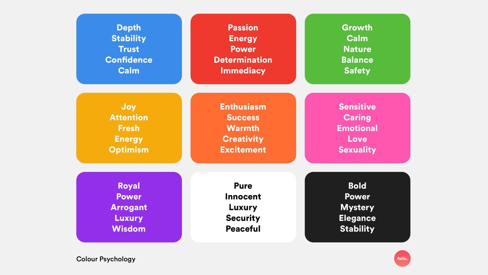
Color is not passive; it is an active influence on human behavior. Color psychology creates a framework for understanding how different hues affect mood and decision-making. In the context of the US market, these associations are deeply ingrained.
- Red: Often associated with energy, passion, and urgency. It stimulates the body and mind, which is why it is frequently used for clearance sales or fast-food chains to encourage quick action and appetite.
- Blue: The color of stability, trust, and calm. It is the dominant color in the corporate US landscape, particularly in banking, healthcare, and technology, where trust is paramount.
- Yellow: Evokes optimism, clarity, and warmth. However, it can be overwhelming if overused. It is often used to grab attention in window displays or traffic signs.
- Green: Synonymous with nature, growth, and in the US specifically, money. It is the go-to for eco-friendly brands and financial services.
Understanding the link between colors and user behavior allows designers to steer perception. If a startup wants to disrupt a traditional industry, they might avoid the standard corporate blue and opt for a vibrant purple or orange to signal innovation. Conversely, a security firm avoiding blue might struggle to convey safety. In color psychology USA studies, we see that aligning color with the desired emotional outcome is essential for conversion.
Role of Color Theory in Branding
A brand is more than a logo; it is the sum of every interaction a customer has with a company. Color is the glue that holds these interactions together. Effective branding color theory relies on establishing a strong, recognizable palette that sets a company apart from its competitors.
Think of the specific red used by Coca-Cola or the “Tiffany Blue” box. These colors are so iconic that they can stand alone without a logo. This level of brand recognition is the ultimate goal. In the US, where consumers are bombarded with thousands of ads daily, consistency is key. A brand must look the same on a mobile app, a billboard, and a product package.
When developing a brand identity, designers look at brand color psychology USA trends to ensure the chosen palette resonates with the target demographic. A luxury brand targeting affluent Americans might use black and gold to signify exclusivity and elegance. A wellness brand might use soft pastels to convey relaxation. The strategic application of color theory ensures that the brand’s values are communicated instantly, before a single word of copy is read.
Color Theory in UI and UX Design
In the realm of digital product design, color serves a functional purpose. It is a navigational tool. UI color theory focuses on creating a visual hierarchy that guides the user through an interface effortlessly.
Designers use color to indicate which elements are interactive. A greyed-out button signals “inactive,” while a bright, high-contrast button signals “submit” or “buy now.” This is critical for User Experience (UX). UX design color principles dictate that the most important information should be the most visually prominent.
Color also helps manage cognitive load. If a dashboard is filled with ten different bright colors, the user won’t know where to look. By restricting the palette and using color sparingly to highlight key data points or alerts, designers make complex information digestible. For example, using red only for error messages and green only for success states creates a consistent mental model for the user, making the application easier to learn and use.
Cultural and Contextual Meaning of Colors
While some color associations are biological, many are cultural. To design effectively for a US audience, one must understand color meaning USA specific contexts.
- White: In the US and many Western cultures, white represents purity, cleanliness, and weddings. In some Eastern cultures, it is the color of mourning. A US bridal website using heavy black (often associated with mourning in the West) would send the wrong message.
- Patriotism: The combination of red, white, and blue has profound significance in the US, evoking patriotism and government. While effective for political campaigns or “Made in USA” products, it can feel cliche or overly governmental for a tech startup.
- Black: Represents sophistication and luxury, but also death or edginess depending on the context.
Context is everything. Cultural color symbolism changes based on the industry. An all-black website works for a high-end architect but might feel gloomy for a children’s daycare. Designers must navigate these cultural waters carefully to avoid miscommunication.
Accessibility and Inclusive Color Design
Designing for the US market means designing for everyone. Accessibility is no longer an optional “nice-to-have”—it is a critical requirement, reinforced by legal standards like the Americans with Disabilities Act (ADA) and Web Content Accessibility Guidelines (WCAG).
Accessible color design ensures that people with visual impairments, such as color blindness or low vision, can still perceive and interact with digital content. Approximately 8% of men and 0.5% of women have some form of color blindness. If a design relies solely on color to convey information (e.g., “click the red button”), a significant portion of the population is excluded.
Color contrast accessibility USA standards require a sufficient contrast ratio between text and background colors to ensure readability. This is particularly important for mobile design, where screens are often viewed in bright sunlight. By prioritizing high contrast and ensuring color is not the only means of communication, designers create inclusive products that reach a wider audience.
Common Color Theory Mistakes in Design
Even experienced designers can fall into traps when working with color. One of the most frequent color design mistakes is over-saturation. Using too many bold, vibrant colors can cause “vibration,” where the colors seem to move or blur when placed next to each other, causing eye strain.
Another common error is ignoring contrast. Light gray text on a white background might look sleek on a designer’s high-end monitor, but it is often unreadable on a budget smartphone or for users with aging eyes. This is a prime example of poor color choices design that sacrifices usability for aesthetics.
Finally, following trends blindly is a recipe for disaster. “Millennial Pink” or “Gen Z Green” might be popular for a season, but if those colors don’t align with the brand’s core values or the psychology of the user base, the design will fail. Strategy must always precede trends.
How Designers Apply Color Theory Effectively
So, how do professionals get it right? They start with structure. Effective designers often use the 60-30-10 rule for color palette design. This guideline suggests that 60% of the design should be a dominant neutral color, 30% a secondary color, and 10% an accent color. This creates balance and ensures the accent color (usually the Call to Action) pops.
Designers also rely on harmony rules—monochromatic (shades of one color), analogous (colors next to each other on the wheel), or complementary (opposites on the wheel). They use tools like Adobe Color or Coolors to test combinations mathematically before applying them.
To apply color theory consistently, large teams use design systems. These are documented libraries of approved colors and usage rules. This ensures that a developer on the West Coast and a designer on the East Coast are using the exact same shade of blue, maintaining brand integrity.
Color Theory in Digital vs Print Design
A fundamental challenge in design is the difference between screens and physical media. Digital vs print color design requires understanding two different color modes: RGB and CMYK.
- RGB (Red, Green, Blue): This is an additive color model used for screens. It creates color by adding light. It is capable of producing bright, neon-like colors.
- CMYK (Cyan, Magenta, Yellow, Key/Black): This is a subtractive model used for printing. It creates color by layering ink on paper.
The mistake many make is designing in RGB and sending it to print without converting. The result is often dull, muddy colors because ink cannot replicate the brightness of a backlit screen. Understanding RGB vs CMYK limitations is essential for maintaining brand consistency across a website and a printed brochure.
Future Trends in Color Theory and Design
As technology evolves, so does the application of color. One of the biggest color design trends USA wide is the adoption of Dark Mode. Initially a developer preference, it is now a standard consumer expectation. This requires designers to create adaptive color palettes that look good on both light and dark backgrounds, shifting semantic colors to maintain contrast.
We are also seeing a move toward data-driven color choices. With A/B testing, companies can now test button colors in real-time to see which shade drives more conversions, moving color theory from intuition to science.
Furthermore, the future of color theory involves AI. Generative design tools can now suggest accessible, harmonious palettes instantly based on a single prompt or image. Personalization is also on the horizon, where interfaces might subtly shift colors based on the user’s preferences or even the time of day.
Frequently Asked Questions (FAQ)
What colors work best for user engagement?
There is no single “magic” color, but high-contrast accent colors generally drive the best engagement for interactive elements. Red and orange are excellent for creating urgency (like sales), while blue builds trust for long-term engagement. The best color is one that stands out clearly against your specific background.
Does color choice affect conversion rates?
Yes, absolutely. Studies have shown that changing a Call to Action (CTA) button color to contrast more sharply with the surrounding design can significantly increase click-through rates. It’s not just about the specific color, but how distinct it is from the rest of the page.
How many colors should a design use?
Less is usually more. A standard best practice is to stick to a primary palette of 3 to 5 colors. This usually includes a main background color, a primary text color, a brand dominance color, and one or two accent colors for highlights and alerts.
Are color trends important in design?
Trends are useful for making a brand feel modern and relevant, but they should be used with caution. Trends fade, but brand identity is long-term. It is better to use trendy colors in temporary assets (like social media ads) rather than anchoring your entire brand identity to a fleeting fad.
How does color theory improve brand identity?
Color theory ensures consistency and emotional resonance. By strictly adhering to a defined palette that aligns with psychological principles, a brand becomes instantly recognizable and communicates its values (like trust, excitement, or luxury) without words.
Final Thoughts on Color Theory in Design
In the fast-moving, highly visual culture of the USA, color is never an afterthought. It is a strategic lever that influences how people feel, where they look, and what they buy. From the psychological depths of consumer behavior to the technical requirements of accessibility and print production, mastering color theory is essential for any designer or brand looking to succeed.
Designers must view color not just as decoration, but as a functional element of the user interface and a core component of the brand story. By combining the science of optics with the psychology of emotion, businesses can create experiences that are not only beautiful but also effective, inclusive, and profitable.