

How Design Psychology Influences Users in the USA
Have you ever wondered why you instinctively trust one website over another within seconds of landing on the homepage? Or why you feel a sudden urge to click a bright red “Buy Now” button, even if you were just browsing? It isn’t an accident. It is the result of carefully calculated decisions rooted in the human psyche.
Design is often mistaken for purely aesthetic work—making things look “pretty.” However, in the highly competitive digital landscape of the United States, successful design goes far beyond visuals. It bridges the gap between business goals and human behavior. By leveraging psychological principles, designers can guide attention, evoke specific emotions, and streamline decision-making processes.
Understanding the subconscious triggers that drive user actions allows businesses to create products that are not only functional but also intuitive and persuasive. When we understand how the brain processes information, we can build experiences that feel natural rather than forced. This article explores the powerful connection between cognitive science and creative execution, revealing how design psychology shapes the way users in the USA interact with the digital world.
What Is Design Psychology?
Design psychology is a discipline that combines neuroscience, cognitive psychology, and social psychology with design principles to influence human behavior. It focuses on the “why” behind user actions. While traditional design might ask, “Does this look good?”, design psychology asks, “How does this make the user feel, and what action does it compel them to take?”
In the context of design psychology USA, this approach is particularly critical. American consumers are exposed to thousands of marketing messages daily. Their attention is a scarce resource. To cut through the noise, designers must understand mental models—the intuitive understanding users have about how things should work based on past experiences.
This field examines three primary factors:
- Cognitive: How users perceive, process, and remember information.
- Emotional: How design elements trigger feelings like trust, joy, or anxiety.
- Behavioral: How layout and cues drive physical actions, such as clicking or scrolling.
Whether in a digital context, like a mobile banking app, or a physical context, like the layout of a grocery store, the goal remains the same: to reduce friction and align the environment with the user’s mental state.
How Design Psychology Influences Users
The way we interact with technology is rarely rational. We like to think we weigh every pro and con, but most online decisions are made on autopilot. Understanding how design psychology influences users USA requires looking at the subconscious shortcuts the brain takes to save energy.
Attention and Focus
The human brain can only process a limited amount of information at once. Designers use psychology to direct the eye to what matters most. Through contrast, scale, and movement, they signal to the brain, “Look here first.” If a landing page has no clear focal point, the user feels overwhelmed and is likely to bounce.
Emotional Response and Trust
First impressions are 94% design-related. If a site looks outdated or chaotic, users in the US often perceive it as untrustworthy or insecure. Conversely, clean lines and familiar structures signal competence. This immediate emotional response happens before the user reads a single word of copy.
Decision-Making and Action
Psychology aids in overcoming “analysis paralysis.” When faced with too many choices, users often choose nothing. By simplifying options and highlighting a preferred path (a concept known as “nudging”), designers make decision-making effortless.
Visual Hierarchy & Cognitive Load
One of the most practical applications of psychology in design is managing visual hierarchy UX. Visual hierarchy refers to the arrangement of elements in a way that implies importance. It tells the user’s brain in which order to process information.
Scanning Patterns
Research shows that users rarely read web pages word-for-word; they scan. Two common patterns dominate:
- F-Pattern: Common for text-heavy pages like blogs. Users scan the top, then move down a bit and read across, and finally scan the left side vertically.
- Z-Pattern: Common for landing pages with less text. The eye moves from the top left (logo) to the top right (menu/CTA), cuts across to the middle left (headline), and finishes at the bottom right (action button).
Reducing Mental Effort
Cognitive load is the amount of mental processing power required to use a product. High cognitive load is the enemy of conversion. Every time a user has to stop and figure out what an icon means or where a menu is hiding, their mental energy drains. Effective visual hierarchy reduces this load by making the path forward obvious.
Guiding User Attention
By manipulating size, color, and whitespace, designers act as tour guides. A large, bold headline grabs attention first. A muted, smaller caption is processed second. If every element on the page is screaming for attention with the same visual weight, the user hears nothing but noise.
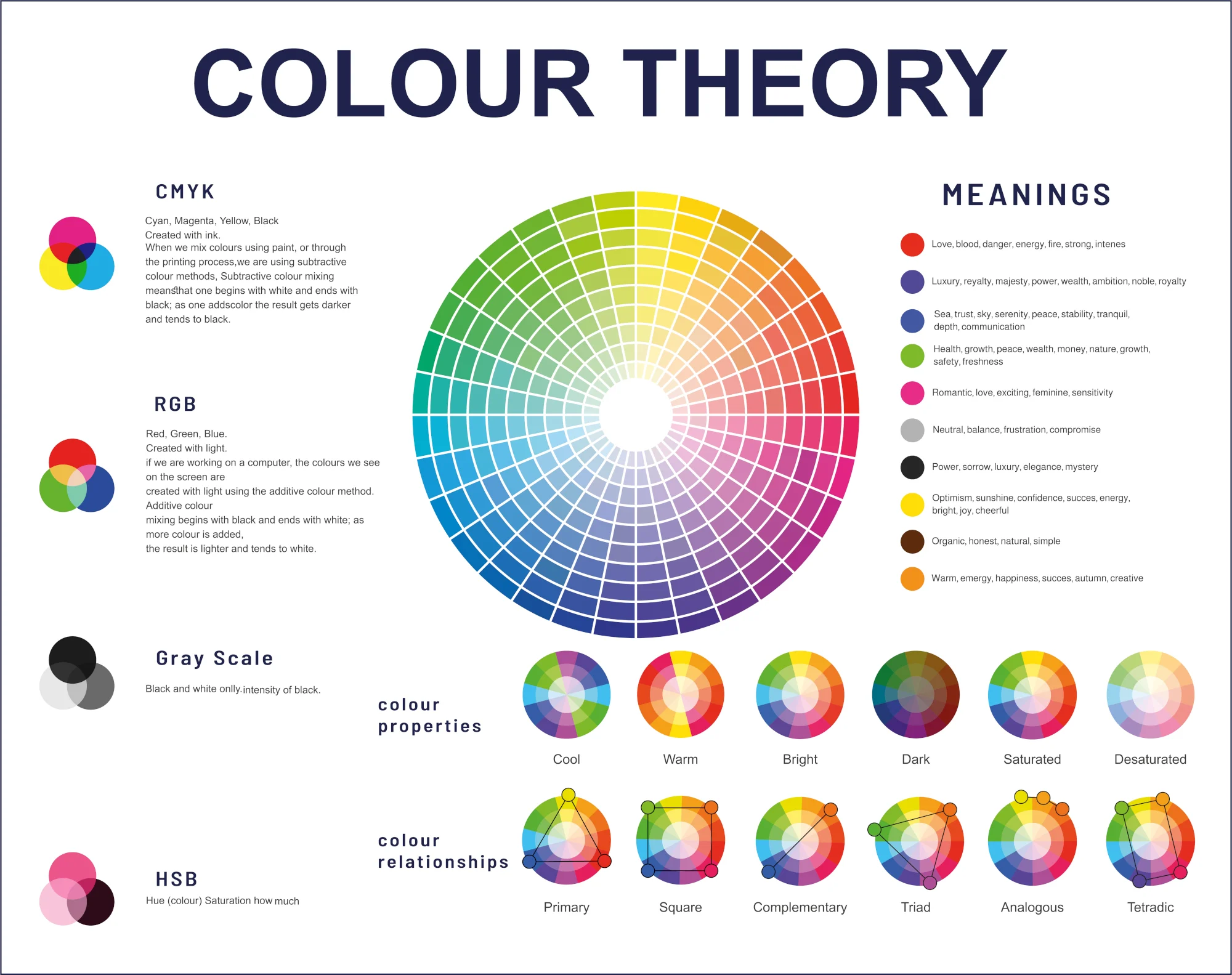
Color Psychology and Emotional Impact
Color is perhaps the most immediate emotional trigger in a designer’s toolkit. Color psychology design USA studies how different hues influence mood and behavior specifically within the American cultural context. While color meanings can vary globally, there are strong associations within the US market.
Color Meanings and Associations
- Blue: The color of trust and stability. It is the dominant color for American banks (Chase, Citi), tech giants (Facebook, LinkedIn), and healthcare providers. It calms the mind and encourages a sense of security.
- Red: Associated with urgency, excitement, and appetite. It increases heart rate, which is why it is the standard for clearance sales, fast food chains, and “Buy Now” buttons.
- Green: Linked to health, growth, and money. It is the go-to for eco-friendly brands and financial apps like Cash App or Mint.
- Black: Signifies luxury, sophistication, and exclusivity. High-end brands use black to create a sense of premium value.
Trust, Urgency, and Comfort Signals
Designers use these associations to send subconscious signals. A financial advisor’s website using bright neon pink might subconsciously signal risk or immaturity to a US audience, whereas deep navy blue signals authority. Conversely, a clearance sale using soft pastels fails to trigger the necessary urgency to drive an impulse buy.
Brand Identity and Perception
Consistency in color psychology builds brand recognition. When a brand deviates from its established palette or uses colors that clash with its industry standards without a strategic reason, it creates cognitive dissonance—a mental discomfort that pushes users away.
Typography, Spacing & Readability
Words convey the message, but typography conveys the tone. Typography UX design is about ensuring that text is legible, readable, and appealing. It plays a massive role in how long a user stays on a page.
Font Choice and Tone
Serif fonts (like Times New Roman) generally feel traditional, respectable, and academic. Sans-serif fonts (like Arial or Helvetica) feel modern, clean, and accessible. A tech startup using a gothic, ornamental font would confuse users because the visual tone contradicts the industry expectation.
Line Spacing and Readability
Proper line spacing (leading) prevents text from looking like a daunting wall of bricks. If lines are too close together, the eye struggles to track from the end of one line to the start of the next. Generous spacing makes content feel lighter and easier to digest, which keeps the user engaged longer.
Accessibility Considerations
Psychology in design also means inclusivity. High-contrast text and scalable fonts ensure that users with visual impairments can access information. When a user struggles to read text because of poor contrast (like light gray text on a white background), they feel frustrated and excluded, damaging their perception of the brand.
Psychology of UX & User Experience Design
User Experience (UX) is where psychology becomes functional mechanics. UX psychology principles are “laws” derived from behavioral science that predict how users interact with interfaces.
Familiarity and Usability Patterns
Jakob’s Law states that users spend most of their time on other sites. This means they prefer your site to work the same way as all the other sites they know. If an e-commerce store puts the shopping cart on the bottom left instead of the top right, it disrupts the user’s mental model, causing frustration.
Feedback Loops and Microinteractions
Humans crave acknowledgement. When we push a physical button, we feel a click. In digital design, microinteractions serve this purpose. A button changing color when hovered over or a loading spinner assures the user that the system has received their request. These small feedback loops provide psychological satisfaction and reduce anxiety about whether the technology is working.
Reducing Friction in User Journeys
Hick’s Law states that the time it takes to make a decision increases with the number and complexity of choices. To apply this, designers break complex processes (like a checkout flow) into small, manageable steps. Seeing a progress bar (e.g., “Step 1 of 3”) motivates users to complete the task because the goal feels attainable.
Emotional Design & User Connection
Functionality makes a product usable; emotion makes it memorable. Emotional design UX focuses on creating interactions that delight users and foster a personal connection.
Creating Positive Emotional Responses
Don Norman, a pioneer in this field, identifies three levels of emotional design: visceral (appearance), behavioral (usability), and reflective (meaning). A beautifully animated success screen after completing a boring task (like filing taxes) operates on the visceral level, giving the user a brief moment of joy.
Delight vs. Distraction
There is a fine line between delight and annoyance. An animated mascot might be cute the first time, but if it pops up every five seconds, it becomes an obstacle. True emotional design enhances the experience without getting in the way of the user’s goal.
Long-term Brand Loyalty
When a product connects emotionally, users are more forgiving of minor errors. Apple has mastered this. Their users feel a sense of identity and pride associated with the products, often overlooking price or compatibility issues because of the emotional bond with the brand design.
Trust, Credibility & Decision Making
In the digital world, trust is the currency of conversion. Without physical interaction, users rely on trust signals design to determine if a business is legitimate.
Social Proof and Authority Cues
The “Bandwagon Effect” is a psychological phenomenon where people do something primarily because other people are doing it. Testimonials, user reviews, and “As Seen On” media logos serve as social proof. Placing these near high-friction points (like a checkout button) reassures the user that they are making a safe choice.
Consistency and Predictability
Inconsistency breeds suspicion. If a user clicks a link in an email and lands on a page that looks completely different in style and tone, they may suspect a phishing scam. Consistent branding across all touchpoints reinforces credibility.
Transparency in Design
Users in the US are increasingly wary of data privacy. Designs that clearly explain why information is needed (e.g., “We need your zip code to calculate shipping”) perform better than those that demand data without context. Transparency reduces anxiety and builds a relationship of reciprocity.
Ethical Use of Design Psychology
With great power comes great responsibility. The same principles used to help users can be used to manipulate them. Ethical design psychology advocates for respecting the user’s best interests.
Avoiding Dark Patterns
Dark patterns are deceptive design tricks used to make users do things they didn’t mean to do, like accidentally signing up for insurance or finding it impossible to cancel a subscription. While these might boost short-term metrics, they destroy long-term trust and can lead to legal repercussions in the US.
Respecting User Autonomy
Ethical design informs rather than coerces. It presents choices neutrally, allowing the user to make a decision based on their true needs. For example, a newsletter popup should have a clearly visible “No thanks” button, not a shaming link that says “No, I hate saving money.”
Designing for Well-being
There is a growing movement towards “humane technology” that respects user time and attention. Instead of designing infinite scrolls that keep users addicted, ethical design might encourage breaks or provide tools to manage screen time, prioritizing user mental health over engagement metrics.
Frequently Asked Questions (FAQ)
Q1. What is design psychology?
Design psychology is the application of psychological principles to design. It explores how cognitive, emotional, and behavioral factors influence how people perceive and interact with products, aiming to create intuitive and effective user experiences.
Q2. How does design psychology influence user behavior?
It influences behavior by guiding attention, evoking emotions, and simplifying decision-making. Through the strategic use of color, layout, and cues, designers can encourage users to click, scroll, buy, or trust a brand.
Q3. Why is UX psychology important for websites and apps?
It ensures that digital products align with how the human brain works. This alignment reduces frustration, makes navigation intuitive, and ultimately leads to higher conversion rates and customer satisfaction.
Q4. How do colors affect user decisions?
Colors trigger subconscious emotional associations. For example, red can create urgency for a sale, while blue can build trust for a bank. Using the wrong colors can confuse users or send the wrong message about a brand’s intent.
Q5. Can good design improve trust and conversions?
Absolutely. High-quality, consistent design signals professionalism and security. Features like clear navigation, social proof, and transparent policies (trust signals) directly correlate with a user’s willingness to make a purchase.
Q6. What are dark patterns in design?
Dark patterns are manipulative design interfaces that trick users into taking actions they didn’t intend to, such as hidden costs in a checkout cart or a subscription that is easy to start but difficult to cancel.
Q7. How can designers use psychology ethically?
Designers should use psychology to facilitate the user’s goals, not just the business’s goals. This involves avoiding manipulation, being transparent about data, and respecting the user’s right to say no.
Final Thoughts: Designing With the User in Mind
The intersection of psychology and design is where true innovation happens. By understanding the cognitive roots of human behavior, we move beyond making things look “nice” to making things work seamlessly for the people who use them.
Whether you are building a mobile app or a physical storefront, the principles remain the same. Users in the USA want efficiency, clarity, and connection. They want to feel smart, secure, and understood. Psychology as a design advantage allows businesses to meet these needs, turning casual browsers into loyal advocates.
Ultimately, user-centered design always wins because it respects the human at the other end of the screen. When we design for the mind, we create experiences that resonate, engage, and endure.